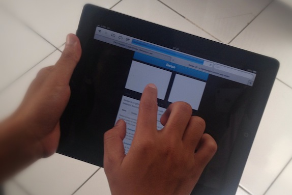
Mobile will eventually become the norm and touch interface IS the norm of mobile experience these days. However, some designers don’t realize (yet) the difference between touch and desktop interface by designing thing which is common in desktop but wouldn’t be really functional in touch interface. As front end developer who translates web designer’s .psd design into working interface, here’s what i can suggest you about the topic:
- Avoid hover-element: an element which is shown if certain element is hovered. How to hover a thing using touch anyway?
- Tap-able area should be rational to finger size. Fingers aren’t precise, or as Apple’s Human Interface Guidelines‘ say: “44 x 44 points is the comfortable minimum size of a tappable UI element.“
- This one is personal: Zooming-in + Zooming-out content doesn’t feel nice. Adjusting design to the device viewport (responsive design) would be helpful.
- Related to point no.3, responsive design takes time but the return is a pleasant experience. However, suit the design with the goal of the website.
- Slow page load is ridiculously annoying. Mobile connectivity’s speed sometimes doesn’t match your expectation. Mobile web user is in the ‘rush’ finding information they need since they’re on the go. If it isn’t that necessary, don’t put it on your design.
- Swiping and dragging slide to navigate slideshow (or slideshow-like elements) feels more natural than tapping navigate button.
- There’s no keyboard shortcut. Make your navigation visible and understandable.
For more information about designing for touch interface, this Tympanus’ posts is an awesome reading about the topic: Fingers are bigger than mice – design concepts for mobile websites.


Nice interesting , agree with you.